Generating color palettes with musical ratios
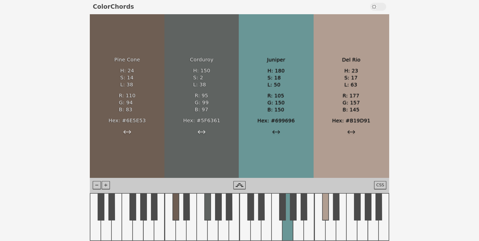
As a developer with a background in music composition, I had an idea for a proof of concept web app called ColorChords, which translated musical harmonic ratios into color space. This was inspired by https://typescale.com/, which applies musical intervals to typography systems. I really enjoy projects like this, little experiments that are built just for the sake of asking “what if I could do x?”. In this case, while slightly useful, the shortcomings in this approach taught me a lot about both music and color theory. After taking a while to revisit and unpack the color palette generation technique I’ve come to a few conclusions about why translating musical intervals directly into colors isn’t as simple as it may seem.
It’s just intonation, right?
Perhaps the most glaring example of why using musical harmonic ratios is sub-optimal involves the distance between colors in color space. Color space and frequency space are both continuous ranges of values, which are most commonly squashed into discrete ranges based on the limits of human perception. Picking any arbitrary value color space will result in a color (a representation of the product of red, green, and blue light waves being reflected off a surface with different intensities), and picking an arbitrary value in audio frequency space results in a fundamental frequency (a continuous oscillating signal with no extra harmonic complexity). Physically sounds and colors are essentially just unique combinations of waves with different frequencies and amplitudes. So with all those similarities the concept of harmony should function pretty similarly in both spaces right? Actually yes, but I was too caught up in the idea of harmonic ratios to realize that.
When it comes to sound, equal temperament, which divides an octave into 12 equal parts, is versatile and widely used in modern music. However, it compromises the purity of harmonic intervals. Just intonation, on the other hand, uses the harmonic series to achieve more natural frequency ratios. The harmonic series uses neat whole number ratios to define the distance between intervals, which seems lazy but is actually based on how resonant bodies like piano or guitar strings oscillate. When you pluck a guitar string, you are not just hearing the fundamental frequency, the string is vibrating at the fundamental frequency, but it is also vibrating at twice that speed just at a lower amplitude and 3x and so on. So by spacing the musical intervals using those natural ratios, Just intonation, accomplishes true mathematical harmony. I decided to go with just intonation because I've always been fascinated with the harmonic series, but if I had read up on my color theory first I probably would have gone with equal temperament to ensure that the colors are more equally spaced.
One of the foundational works in the systematization of colors and color harmony was the Ostwald Color System, which emphasizes the importance of rhythm and balance in color palettes. According to Ostwald, effective color schemes should feature hues that are equally spaced within a given color space. To illustrate this he used a three dimensional model, sort of like a low poly squished sphere, with white at the center and more saturated colors the further you are from the center. It pretty seriously quantizes the coordinate space, instead of having a continuous gradient with millions of possible colors, there are only 680 possible colors in the system. This 3D grid with consistent ratios makes quantifying and identifying harmonic color combinations much easier.
Choosing the Right Color Space
I used the HSL (Hue, Saturation, Lightness) color model to map colors to musical notes. RGB does technically reflect the physical/mathematical aspect of colors quite well, however as we saw with Just intonation, the math of harmony doesn't always translate to beauty. That is more a matter of perception. We do technically perceive red, green, and blue light waves reflected off surfaces, but that doesn't really register cognitively. You wouldn't say a sunset is "so 30% less blue than it is red", you might say its "so pink and bold and bright", which makes HSL (hue, saturation, lightness) color space much more accessible for the average person. I had used HSL quite a bit and new CSS color spaces weren’t available yet in most browsers. However, after some reflection I realized that HSL isn’t the best model for this purpose because while it is a more human way of describing colors, it is not great at showing those colors how we would see them in the real world. I’d like to go back and add an option to use OKLab, a color space that accounts for human visual perception more accurately. This shift might more accurately reflect the intervals while still adhering to musical harmonic rules.
Conclusion
Returning to this project, I learned that creating a visually appealing color palette using musical harmony principles involves much more than a straightforward translation of notes to colors. The many nuances of the math and physics of harmony and human perception require in depth consideration to create appealing representations of these relationships. Overall its been a great exercise in extracting constructive criticism from unsuccessful projects, as well as understanding the importance of investigating the minute details of the core concepts of a project to achieve optimal results.